Color Magic: Perfecting Paint Choices for Every Room
Lifestyle July 19, 2025
Lifestyle July 19, 2025
Elevating Your Home: A Thoughtful Approach to Choosing Interior Paint Colors in Southern California
Paint is one of the most transformative and cost-effective tools in home design. The right color palette can shape mood, define function, and create cohesion throughout your living spaces. In the light-rich, diverse neighborhoods of Northern Los Angeles County and the Santa Clarita Valley, selecting interior paint colors requires a nuanced approach—one that considers light, architecture, purpose, and personal style.
Whether you're preparing your home for sale or simply refreshing a space, the considerations below can help guide a more informed and intentional color strategy.
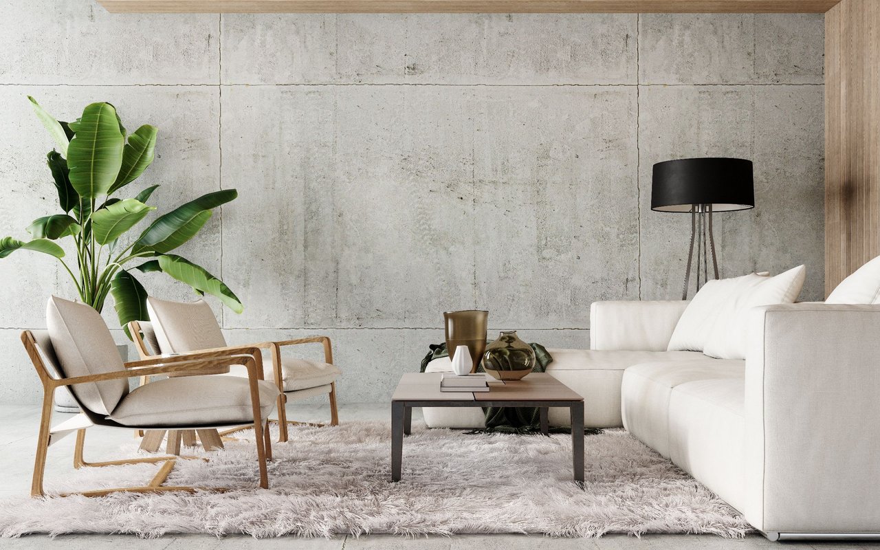
Color profoundly impacts how we experience a space. Blues and greens often evoke calm and clarity, making them ideal for bedrooms, bathrooms, and spaces dedicated to relaxation. Warm tones like clay, sienna, and ochre encourage energy, warmth, and social interaction—well-suited for kitchens, dining rooms, and family areas.
Rather than relying on trends, begin by identifying how you want each room to feel, and select hues that reinforce that emotional tone. This approach creates both visual harmony and psychological comfort.
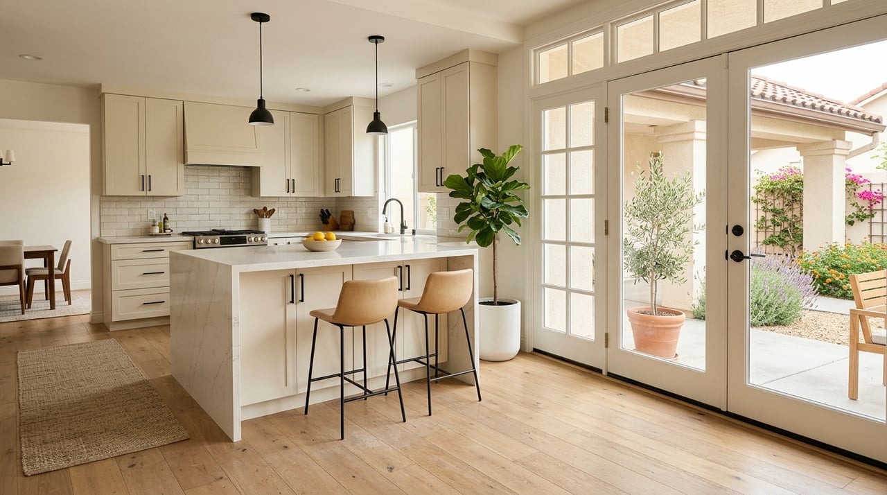
Southern California’s dynamic light quality—bright, golden, and ever-changing—can dramatically affect how paint appears throughout the day. In homes across Santa Clarita, a color that looks soft and subtle in the morning may feel completely different under warm afternoon light.
Rooms with large windows or southern exposure can handle deeper or more saturated tones, while low-light rooms may benefit from soft neutrals that reflect available light. Sampling colors on multiple walls and observing them at different times is a critical step that reveals undertones and helps avoid unexpected shifts in appearance.
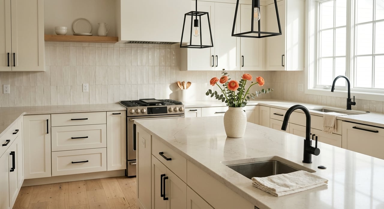
Each room serves a distinct function, and color should support that purpose. Soft, desaturated colors—such as misty greens, muted taupes, or dove grays—can help foster concentration and calm in offices and study spaces. Communal areas may benefit from warmer undertones that create a sense of welcome and ease.
When selecting colors, think about how people interact within the space. Does the room invite conversation? Focus? Solitude? Matching color to behavior lends your design clarity and intent.
Homes with open or semi-open floor plans, which are common in newer builds and remodels across the region, require careful coordination between adjoining spaces. Instead of choosing entirely distinct colors for each room, opt for a unified palette with variations in depth and tone. This ensures a visual flow while allowing each space to retain its own identity.
Anchoring your palette with a timeless neutral—such as warm ivory, greige, or soft mushroom—makes it easy to layer in bolder accents or natural materials without disrupting continuity.
Accent walls can bring definition and visual interest when used sparingly and thoughtfully. While the trend of high-contrast feature walls is evolving, an accent wall in a restrained hue or subtle texture can still add architectural weight and dimension to a room.
Consider less saturated tones, painted millwork, or even limewash finishes to create depth without overpowering the space. Placement also matters: accent walls are most effective when they highlight a natural focal point—like a fireplace, headboard wall, or built-in shelving.
Paint is notoriously deceptive on a swatch. A color that seems perfect in a store may take on entirely different qualities once applied at scale. Always test samples directly on your walls, in multiple locations, and observe how they shift with both natural and artificial light throughout the day.
This step may feel small, but it often prevents costly and time-consuming corrections later.
While bold color can add vibrancy and personality, it requires a sense of proportion. Rather than saturating entire rooms with vivid hues, consider using bold tones selectively—on cabinetry, trim, or in powder rooms—while maintaining a quiet, neutral backdrop elsewhere.
This balance allows color to serve as a design element rather than a distraction, and it’s especially effective in homes where architecture or landscape already makes a strong statement.
Finish matters. A matte or flat finish can offer a sophisticated, velvety look but may lack durability in high-traffic areas. Eggshell or satin finishes strike a balance between elegance and ease of maintenance, while gloss can add dimension to trim or built-ins.
In homes with older architectural features—whether mid-century ranches or traditional California-style builds—paint can either highlight or downplay these elements. Use finish to draw attention to craftsmanship, or to soften the visual transitions between eras in a remodeled home.
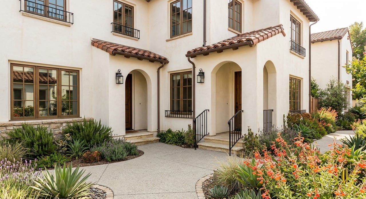
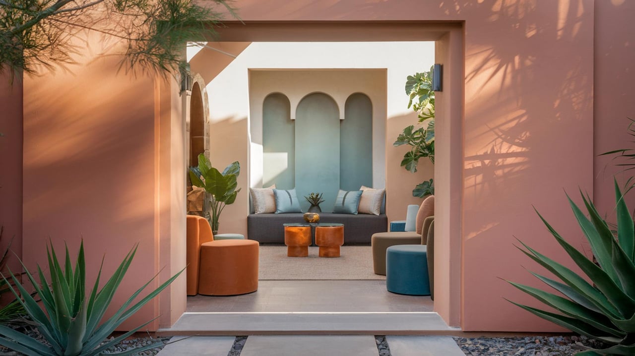
Southern California design has long embraced a quiet restraint rooted in natural materials, clean lines, and indoor-outdoor fluidity. When choosing paint colors, lean toward tones that reflect the local landscape: sandstone, eucalyptus, sun-faded terracotta, marine blue, fog gray.
These hues feel grounded and enduring, and they allow your furnishings, textures, and artwork to speak clearly—without competing with the walls themselves.
Thoughtful paint selection is one of the most effective ways to shape how your home feels and functions. It’s about more than color—it’s about clarity of purpose, sensitivity to environment, and a commitment to spaces that feel intentional and lived in.
If you’re considering updates, or simply want guidance aligning your color choices with broader real estate design goals, contact 35 Oaks Property Group to begin the conversation.

Who you choose to represent your interests in real estate matters. The brokerage with whom you partner with guides you through the sale or acquisition of a subject property, while advocating on your behalf, and serving as a fiduciary and trusted asset advisor. With distinct standards and dynamic experience, the 35 Oaks team provides exclusive listing services for home and land sellers, and buyer representation for those seeking to purchase real property or vacant land.