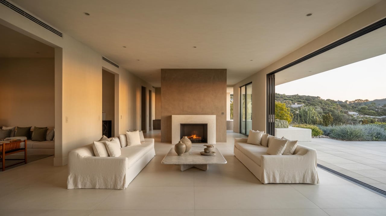
How Paint Undertones Shape Buyer Perception & Home Value in Santa Clarita
Real Estate September 24, 2025

Real Estate September 24, 2025
Selecting the right paint isn’t just aesthetic—it’s strategic. In Santa Clarita’s active housing market, subtle decisions around undertones and color coordination can either enhance or erode buyer appeal. A well-chosen palette encourages emotional connection, draws attention to architecture, and supports perceived value. But a palette that feels disjointed or overly trendy may do the opposite.
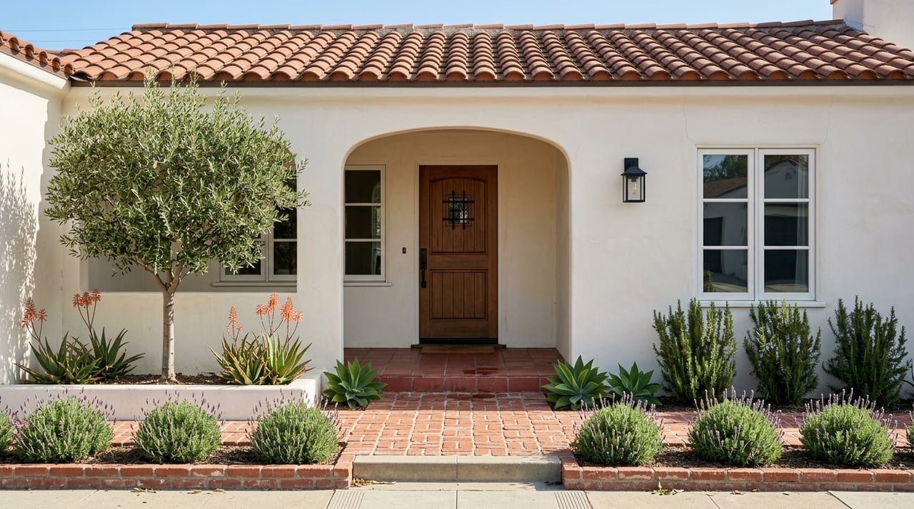
Santa Clarita’s neighborhoods carry distinct design vocabularies, so paint choices must respond intelligently to context. In Stevenson Ranch, many homes lean modern or transitional, favoring warm greiges and softer neutrals. In Valencia’s Summit and Old Orchard areas, Mediterranean and Spanish-revival influences dominate, encouraging warm earth tones, muted terracottas, and sandy hues. Newhall is more eclectic—mixing Craftsman, traditional, and newer infill—so its homes often benefit from a more neutral or cooler palette that can harmonize with varied materials like brick, wood, and stone.
Matching the undertones and color temperature (warm, cool, or neutral) of your paint to the neighborhood’s prevailing palette helps avoid the “odd one out” effect that turns off cautious buyers.
Undertones are the subtle hue beneath a paint’s dominant color. A beige might lean pink, yellow, or green—even though it reads “beige.” Those hidden tones determine how the color behaves under natural and artificial light.
Warm undertones (yellow, red, or brown hints) foster an inviting, cozy feeling.
Cool undertones (blue, green, or gray hints) evoke crispness or calm.
Neutral undertones aim for balance.
Coordinating across walls, trim, and ceilings with a coherent undertone scheme gives a home a refined, “finished” feel, while mismatched undertones create a subtle dissonance buyers instantly perceive.
Fresh, well-coordinated paint can raise a home’s perceived value by several percentage points. Neutral and versatile undertones often appeal to broader audiences, while carefully chosen accent colors can highlight architectural features. By contrast, overly bold or polarizing colors may alienate buyers, mismatched undertones create visual friction, and overly trend-driven palettes can date quickly.
A smart strategy: establish a timeless base and let accent areas—trim, doors, built-ins—carry bolder or trend-forward color notes.
Benjamin Moore’s Color of the Year for 2025 is Cinnamon Slate 2113-40, a nuanced plum-brown that feels both grounded and versatile. Their broader palette highlights calming, sophisticated tones like Ashwood Moss, Rosepine, Paris Rain, and Glacier White.
Side note: One of Benjamin Moore’s most iconic and best-selling whites is White Dove, a hue beloved for its timeless warmth and versatility. In the Aura finish, it offers exceptional depth, durability, and color stability under changing light—making it a reliable choice indoors and out. Shout out to Benjamin Moore for consistently setting the tone for inspired palettes.
Looking ahead to Fall/Winter, designers anticipate deeper neutrals, earthy browns, olive greens, moody taupes, and layered finishes that emphasize texture. These palettes offer warmth and sophistication while remaining flexible enough for long-term appeal.
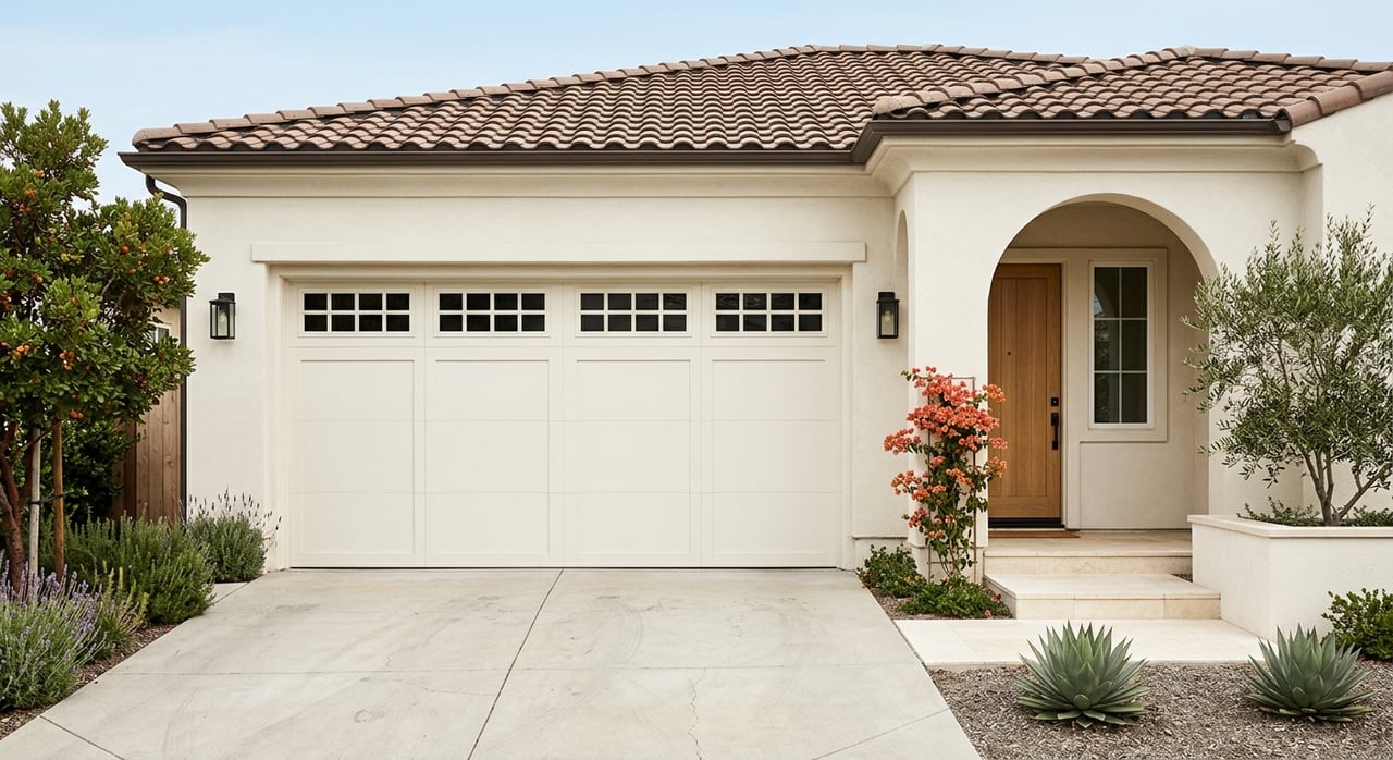
The exterior is your home’s first impression, and it sets expectations for everything inside. Mid-tone neutrals, soft greiges, or warm taupes often weather more gracefully than stark whites or saturated colors, which can fade quickly in Santa Clarita’s abundant sun. Accent elements such as doors, shutters, or trim are ideal for introducing personality while keeping the primary body timeless.
It’s also critical to remember that many Santa Clarita communities—particularly areas like Stevenson Ranch and Valencia—have HOA or community guidelines regulating exterior palettes. Always review these standards before committing to a color scheme to avoid conflicts or costly rework. A well-maintained, HOA-compliant exterior not only preserves curb appeal but also reassures potential buyers of long-term care and consistency.
Begin with your architecture and neighborhood context, select a foundational palette with harmonized undertones, and use accent colors sparingly to layer personality. Always test paints under your home’s natural light at different times of day. Balance timelessness with thoughtful nods to current trends, and you’ll achieve a look that feels both current and enduring.
At 35 Oaks, we see color as more than cosmetic—it’s a way to shape impression, preserve value, and create a home that resonates with buyers. With careful attention to undertones, neighborhood character, and design balance, every paint choice becomes part of a larger, more confident vision.

Who you choose to represent your interests in real estate matters. The brokerage with whom you partner with guides you through the sale or acquisition of a subject property, while advocating on your behalf, and serving as a fiduciary and trusted asset advisor. With distinct standards and dynamic experience, the 35 Oaks team provides exclusive listing services for home and land sellers, and buyer representation for those seeking to purchase real property or vacant land.